Social Media Icons With Hover Animation Using HTML & CSS

 Social Media Icons With Hover Animation Using HTML and CSS Welcome to my website. In this article, we learn how to create Social Media Icons With Hover Animation Using
Welcome to my website. In this article, we learn how to create Social Media Icons With Hover Animation Using HTML and CSS. In this Project, we’ll use HTML and CSS to create some of the most well-known Social Media Icons.
Different apps can have a distinct personalities thanks to social media icons. Icons are typically used to designate a specific website or app. This is why these icons should always point to your company’s account on a particular site rather than the home page itself.
I Hope you enjoy my blog so let’s start with a basic Html Structure for Social Media Icons Hover Animation.
HTML Code For Social Media Icons Hover Animation
HTML stands for HyperText Markup Language. This is a markup language. Its main job is to give our project structure. We will provide our project structure by utilising this markup language. So let’s look at our HTML code.
<!DOCTYPE html>
<html lang="en">
  <head>
    <meta charset="UTF-8" />
    <meta http-equiv="X-UA-Compatible" content="IE=edge" />
    <meta name="viewport" content="width=device-width, initial-scale=1.0" />
    <title>Document</title>
    <title>Socail Media Icon</title>
    <link rel="stylesheet" href="styles.css" />
    <link rel="stylesheet" href="https://cdnjs.cloudflare.com/ajax/libs/font-awesome/6.3.0/css/all.min.css" integrity="sha512-SzlrxWUlpfuzQ+pcUCosxcglQRNAq/DZjVsC0lE40xsADsfeQoEypE+enwcOiGjk/bSuGGKHEyjSoQ1zVisanQ==" crossorigin="anonymous" referrerpolicy="no-referrer" />
  </head>
  <body>
    <div>
      <ul>
          <li><a href="#" target="blank"><i class="fab fa-github"></i></i></a></li>
          <li><a href="#" target="blank"><i class="fab fa-instagram"></i></a></li>
          <li><a href="#" target="blank"><i class="fab fa-linkedin-in"></i></a></li>
          <li><a href="#"><i class="fab fa-codepen" target="blank"></i></a></li>
      </ul>
    </div>
  </body>
</html>
In order to add styling to our social media symbol webpage, we must first add the font-awesome import link and external stylesheet link inside our html file. These links must be present before we can add the icon to the page.
<link rel="stylesheet" href="https://cdnjs.cloudflare.com/ajax/libs/font-awesome/6.3.0/css/all.min.css" integrity="sha512-SzlrxWUlpfuzQ+pcUCosxcglQRNAq/DZjVsC0lE40xsADsfeQoEypE+enwcOiGjk/bSuGGKHEyjSoQ1zVisanQ==" crossorigin="anonymous" referrerpolicy="no-referrer" />
<link rel="stylesheet" href="styles.css">
Now we will be adding the icons using the font awesome classes .First of all using the <div> tag we will create the container for our social media icons and using the <i> tag with with specific class names we will create the social media icons.
<div class="">
<ul>
<li><a href="https://github.com/sanketbodke" target="blank"><i class="fab fa-github"></i></i></a></li>
<li><a href="https://www.instagram.com/imsanketbodke/" target="blank"><i class="fab fa-instagram"></i></a></li>
<li><a href="https://www.linkedin.com/in/sanket-bodake-995b5b205/" target="blank"><i class="fab fa-linkedin-in"></i></a></li>
<li><a href="https://codepen.io/sanketbodke"><i class="fab fa-codepen" target="blank"></i></a></li>
</ul>
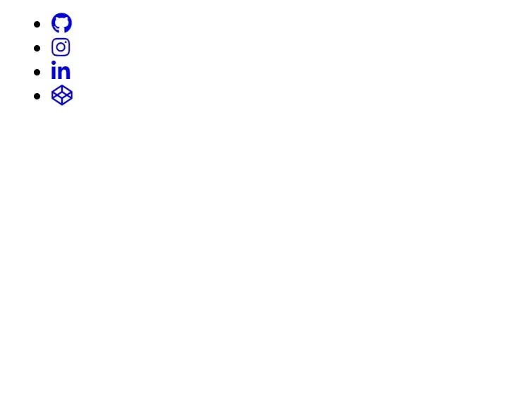
</div>There is all the Html Code for the Social Media Icons Hover Animation. Now, you can see output without Css. then we write CSS Code For Social Media Icons Hover Animation.
HTML Output
CSS Code For Social Media Icons Hover Animation
body {
  background: #d8d8d8;
}
ul {
  position: absolute;
  top: 50%;
  left: 50%;
  padding: 0;
  margin: 0;
  transform: translate(-50%, -50%);
  display: flex;
}
ul li {
  list-style: none;
  margin: 0 15px;
}
ul li .fab {
  font-size: 30px;
  line-height: 60px;
  transition: 0.3s;
  color: #000;
}
ul li .fab:hover {
  color: #fff;
}
ul li a {
  position: relative;
  display: block;
  width: 60px;
  height: 60px;
  border-radius: 50%;
  background-color: #fff;
  text-align: center;
  transition: 0.6s;
  box-shadow: 0 5px 4px rgba(0, 0, 0, 0.5);
}
ul li a:hover {
  transform: translate(0, -10%);
}
ul li:nth-child(1) a:hover {
  background-color: rgba(0, 0, 0, 0.829);
}
ul li:nth-child(2) a:hover {
  background-color: #e4405f;
}
ul li:nth-child(3) a:hover {
  background-color: #0077b5;
}
ul li:nth-child(4) a:hover {
  background-color: #000;
}
Step1:We will style the body of the website using the body tag selector. We’ll apply a background colour of “grey” using the background property.
The location will now be set to “absolute” using the class selector (.social-menu ul). The top and left properties will be used to add 50% top and left spaces, and the padding and margin properties will be used to set the margin and padding to zero. Flex is selected for the show.

Step2:Now that we have chosen the child object using the parent-child class selector, we will style our icons. We’ll use the font-size property to change the font size to “30px,” and the line-height property to add a line height of 60px.
Using the hover property, we will also add the hover colour property to our social media icons, causing the icon’s colour to shift as the user hovers over it.
ul li .fab:hover {
  color: #fff;
}
ul li a {
  position: relative;
  display: block;
  width: 60px;
  height: 60px;
  border-radius: 50%;
  background-color: #fff;
  text-align: center;
  transition: 0.6s;
  box-shadow: 0 5px 4px rgba(0, 0, 0, 0.5);
}
ul li a:hover {
  transform: translate(0, -10%);
}
ul li:nth-child(1) a:hover {
  background-color: rgba(0, 0, 0, 0.829);
}
ul li:nth-child(2) a:hover {
  background-color: #e4405f;
}
ul li:nth-child(3) a:hover {
  background-color: #0077b5;
}
ul li:nth-child(4) a:hover {
  background-color: #000;
}
CSS Output:
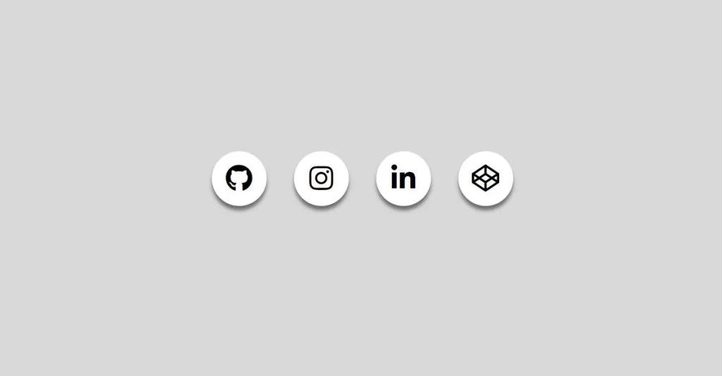
We have completed our Social Media Icons Hover Animation Project. Here is our final updated output HTML + CSS.
We have completed our Social Media Icons Hover Animation. Here is our updated output with Html and Css. Hope you like the Social Media Icons Hover Animation Project. you can see the output project screenshots. See our other blogs and gain knowledge in front-end development.
Thank you!
This post teaches us to create Social Media Icons and Hover Animation Using Html and Css. If we made a mistake or any confusion, please drop a comment to reply or help you in easy learning.
Table of Contents

Related Posts

Comments
Rohit Singh:
hi